
ART CONSERVATOR
DIGITAL
A PUBLICATION OF THE WILLIAMSTOWN + ATLANTA ART CONSERVATION CENTER
VOLUME 15. NO.2 collage triage
COLLAGE TRIAGE | Preserving Eric Carle’s Palette
BROOK PRESTOWITZ | ASSOC. CONSERVATOR OF PAPER CONSERVATION
It was a bleak February day when Ellen Keiter, Chief Curator of The Eric Carle Museum of Picture Book Art, brought a little collage called Cows & tractor on farm/field by Eric Carle to the WACC. It is an alternative, unpublished illustration for All Around Us from 1986. The collage depicts a farmer on a tractor in his field with two cows (fig.1) and is scheduled to be part of the exhibition On the Move with Eric Carle, March 13 - August 22, 2021.
Carle arranged various pieces of brightly colored tissue papers that he had painted previously with different colored acrylic paints, and adhered the pieces to an illustration board to create the collage. The illustration board is a drawing support made with a good quality, cotton rag wove paper mounted onto a medium to poor quality paper board backing. The verso of the illustration board often has a medium quality facing paper that has manufacturing labels printed on it. However, before it could be exhibited, the work needed to be stabilized with conservation treatment.
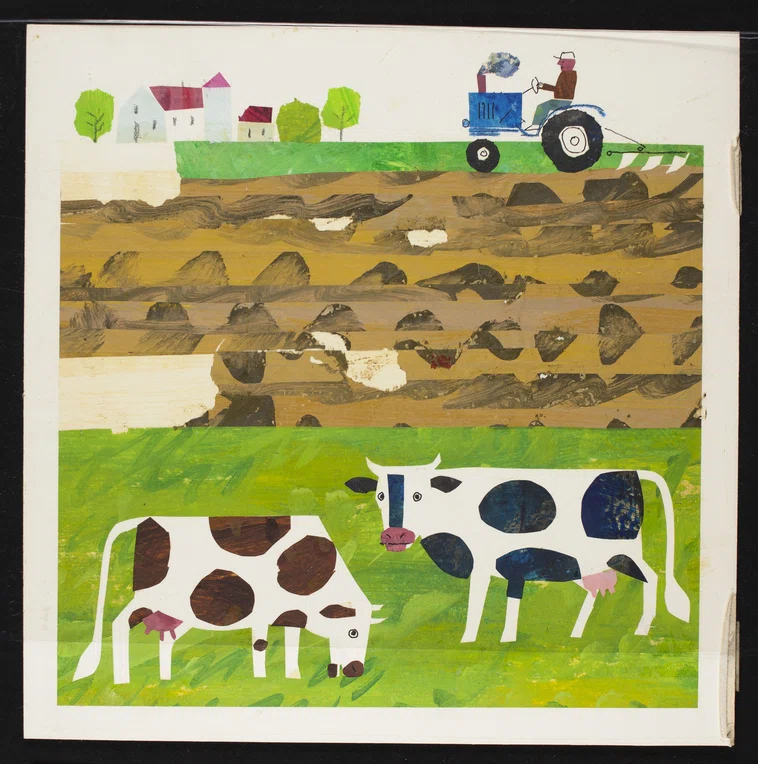
FIGURE 1. Before treatment image of Cows & tractor on farm/field, alternate illustration for All Around Us by Eric Carle, 1986, acrylic painted colored tissue paper collage on illustration board. The mylar sleeve stuck to the front of the collage is difficult to see; but the bottom edge is just visible across the legs of the cows. Treatment photography taken by Matthew Hamilton, WACC Imaging Department. (Eric Carle. Alternate illustration for All Around Us. Collection of Eric and Barbara Carle. © 1986 Penguin Random House LLC.)
CONDITION ISSUES
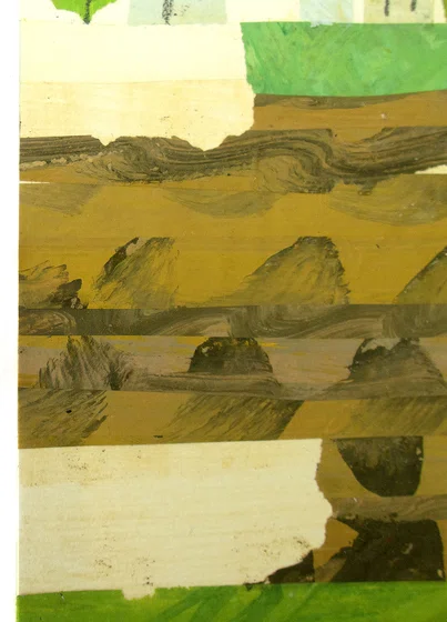
FIGURE 2. Detail of rubber cement discoloration visible in areas of loss in the paper collage elements. Treatment photography taken by Brook Prestowitz, WACC Associate Paper Conservator. (Eric Carle. Alternate illustration for All Around Us. Collection of Eric and Barbara Carle. © 1986 Penguin Random House LLC.)
A Closer Look at Carle’s Materials + Techniques
“To create his signature collages, Carle paints white tissue papers with acrylics to achieve the vibrant colors and patterns he desires. Each piece is an abstract work of art that he can cut and use in a collage. 'My painted papers are like palette', he says. Carle keeps his painted tissue papers in flat file drawers, arranged by color. He enjoys listening to classical music while painting in his studio. His tools vary from paintbrushes and palette knives to brooms, sponges, and carpet squares. Prior to the mid-1980s, Carle used commercially available, pre-dyed tissue papers, the colors of which quickly faded. Today he employs acid-free paper and methyl cellulose adhesive, rather than rubber cement, to ensure the longevity of his art. ” [1]
“My painted papers are like my palette."
-ERIC CARLE
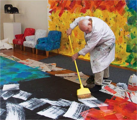
FIGURE 3 . Eric Carle painting a mural with a broom in his studio. © The Eric Carle Museum of Picture Book Art, Amherst, Massachusetts.
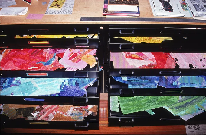
FIGURE 4. Eric Carle’s tissue paper files. © The Eric Carle Museum of Picture Book Art, Amherst, Massachusetts.
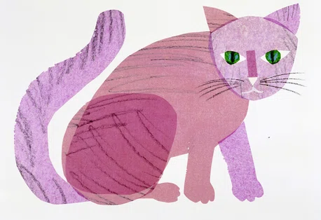
FIGURE 5. This cat was originally a purple color when Carle created it for Brown Bear, Brown Bear, What Do You See?. The dyes in the tissue paper were light sensitive and have faded from purple to pink. (Eric Carle, Illustration for Brown Bear, Brown Bear, What Do You See? by Bill Martin Jr., 1983. Collection of Eric and Barbara Carle. © 1967, 1992 Penguin Random House LLC.)
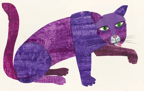
FIGURE 6. Carle re-made this illustration to represent the original colors as he had intended when he first made the illustrations for Brown Bear, Brown Bear, What Do You See?. (Eric Carle, Illustration for Brown Bear, Brown Bear, What Do You See? by Bill Martin Jr., 1992. Collection of Eric and Barbara Carle. © 1967, 1992 Penguin Random House LLC.)
TREATMENT
In order to separate the mylar from the paint, it was necessary to use the Tg of acrylic paints to the conservator’s advantage. Consultation with Maggie Barkovic, WACC Associate Paintings Conservator, aided in determining what method to use to deliver heat and what temperature to soften the paint layer—just enough to release the mylar (65-70°F) but not too much to the point of damaging the paint film. Once the Mylar was separated, it was possible to surface clean the recto and verso of the illustration, avoiding any media. The areas of paper collage elements that were detaching from the illustration board were secured in place with wheat starch paste. The delamination and crushed surface layer of the illustration board was relaxed with controlled moisture and consolidated with wheat starch paste.
Next, the areas of loss in the brown section were addressed. Conservation treatment steps can be divided into two categories: stabilizing the artwork’s physical and chemical condition to improve its long-term preservation and accessibility, and making aesthetic improvements to reintegrate disfiguring damage. The cosmetic treatment steps for aesthetic improvement are not necessary for the stabilization of the work, however, they may be important for reintegrating loss or damage so that the work has visual unity and maintains its aesthetic integrity. The aesthetic of Carle’s illustration is essential to its interpretation, warranting cosmetic treatment steps.
Determining how much cosmetic work is appropriate for a work of art requires the conservator to be informed about the artist’s intent and any preferences that artist had/has regarding the interaction of conservators with their artwork. The degree of intervention is different for each object. The decision processes also involves discussions between the conservator and curator to determine what degree of compensation is appropriate. Since the area of loss in Carle’s collage was relatively large and visually distracting, it was initially decided that paper fills could be made and toned with acrylic paints to a color sympathetic to the mid-tone browns in the existing plowed field. This type of fill would be easily discerned from Carle’s original material but would provide enough compensation for the loss that the eye would not be immediately drawn to the missing parts of the collage. The fills would allow the viewer to appreciate the image before realizing there was some loss compensation in parts of the collage.
However, conversations with Keiter revealed that Carle was interested in retaining the impact of the palette he used for his works. This is evident by his decision to use better quality materials and in his work to recreate some of the faded illustrations. Additionally, Keiter indicated that the museum had a color photograph of the collage prior to the damage in their records (fig.7) that could be used as a reference during loss compensation. Based on this information, it was decided to carry out more involved loss compensation to improve the aesthetics of the collage. Fills were created with reconstructed brushwork that emulated what was originally created by Carle using the photograph as a reference. This type of fill is even more integrated with the image than the type of fill initially discussed and is intended to restore how the collaged image appeared originally.
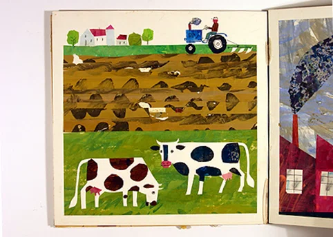
FIGURE 7. This image was provided by the museum as a reference for the conservator to design a more detailed fill that mimicked the original design created by Carle.
(Eric Carle. Alternate illustration for All Around Us. Collection of Eric and Barbara Carle. © 1986 Penguin Random House LLC.)
When creating a fill for a loss in paper works, a fill paper is selected that is as close to the texture, tone, and thickness of the original paper. If the paper does not match in tone, a closer match to the original paper tone can be achieved by coloring the paper with watercolors or acrylic paints. A very thin, machine-made, cotton, wove paper was selected as a good match in texture and weight of the original collage paper. Acrylic paints were selected to tone and design the fill following the patterns shown in the photograph of the collage before it was damaged (Fig.8). The acrylic paints were applied working to mimic the layering of different colored paints as well as the texture of the brush strokes. The paint was applied over a large swath of the fill paper. The shapes of the losses were traced by placing silicone release mylar over the collage (the silicone prevented this mylar film from sticking to the surface of the collage). The traced shapes were transferred to the toned paper and the fills were cut out (fig.9). After checking that the fills were the right shapes, they were secured in place with wheat starch paste. They were overlapped when applied to the areas of loss to emulate the layering of the existing paper collage elements for effective integration with the rest of the work.
FIGURE 8. Different tones of brown acrylic paints were mixed and compared to the original colors to create a sympathetic fill for the losses. Treatment photography by Brook Prestowitz, WACC Associate Paper Conservator. (Eric Carle. Alternate illustration for All Around Us. Collection of Eric and Barbara Carle. © 1986 Penguin Random House LLC.)
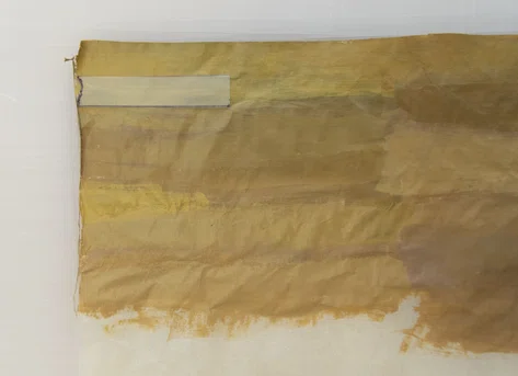
FIGURE 9. A mylar template, shown at the top left, was traced from an area of loss and used to cut out a fill from the toned paper. The darker brown design elements were added after cutting the fill from the fill paper. Treatment photography by Brook Prestowitz, WACC Associate Paper Conservator. (Eric Carle. Alternate illustration for All Around Us. Collection of Eric and Barbara Carle. © 1986 Penguin Random House LLC.)
While separation of the mylar from the front of the collage was successful, it was not possible to completely prevent some loss in the paint film. A barrier layer of methyl cellulose (4% w/v) was applied to areas of paint loss. The losses were then inpainted with QOR ® Watercolors, watercolors with an Aquazol® resin binder manufactured by Golden® Artist Colors, Inc.
Written and photographic documentation of this treatment was conducted to indicate what has been done to the collage. This distinguishes what is original and what has been introduced through conservation. It also provides information for future conservators that would allow these changes to be reversed if so desired. A comparison of the collage before and after treatment is presented in figures 10-11.
FIGURE 10. Cows & tractor on farm/field by Eric Carle before treatment. Treatment photography taken by Matthew Hamilton. (Eric Carle. Alternate illustration for All Around Us. Collection of Eric and Barbara Carle. © 1986 Penguin Random House LLC.)
FIGURE 11. Cows & tractor on farm/field by Eric Carle after treatment. Treatment photography taken by Matthew Hamilton. (Eric Carle. Alternate illustration for All Around Us. Collection of Eric and Barbara Carle. © 1986 Penguin Random House LLC.)
LONG TERM PRESERVATION
The rubber cement will continue to degrade and lose its function to adhere the papers to the illustration board. The collage should be monitored over time to check for new areas of detachment. This will indicate if the collage is stable for exhibition or if it needs conservation treatment. Controlling light exposure will also help slow the degradation of the rubber cement.
Since the brown acrylic paint remains tacky, exhibition and storage methods that prevent any housing materials from touching the surface will be carried out. A window mat will protect the work from touching the frame glazing while on display and a storage box will protect the surface of the unframed work while in storage. The housing methods will also prevent dust and soil from depositing on the surface and becoming imbedded in the tacky paint layer.
CONCLUSION
Acknowledgement
I would like to thank Ellen Keiter, Chief Curator of The Eric Carle Museum of Picture Book Art, for sharing her expertise on Eric Carle’s work and for recommending the use of the images of Carle at work, his studio, and other collages. I would also like to acknowledge Jaime Pagana, Digital Assets & Exhibition Coordinator of The Eric Carle Museum of Picture Book Art, for sending the images shared in this article and for providing the image credit information. Another thanks to Rachel Eskridge, Assistant Registrar of The Eric Carle Museum of Picture Book Art, for providing the image of Cows & tractor on farm/field used as a reference during treatment.
Photography Credit
REFERENCES
[1] Personal communications with Ellen Keiter regarding Eric Carle’s working methods and materials.
[2] Golden Artist Colors, Inc.. 2001. Conservation of Acrylic Paintings. Just Paint, 9. Accessible at: https://justpaint.org/conservation-of-acrylic-paintings/
[3] Ferraro, J. 2019. “Approach to Light Exposure at the US Army Heritage and Education”. Book and Paper Annual 39. Washington DC: American Institute for Conservation, pp. 9-14.

